Projects :
Composition Photos
|
|
|
|
|
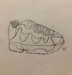
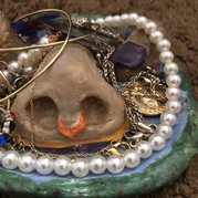
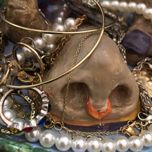
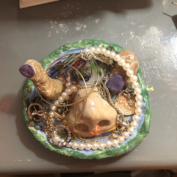
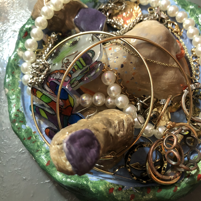
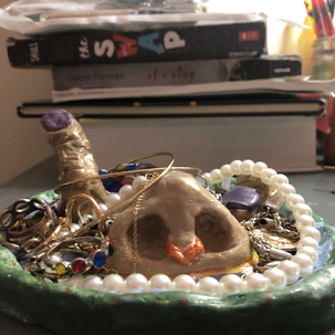
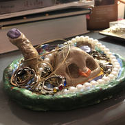
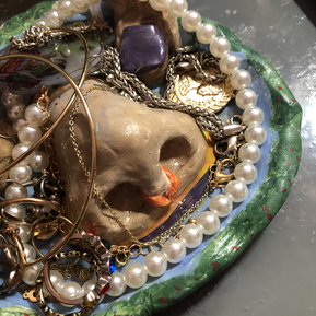
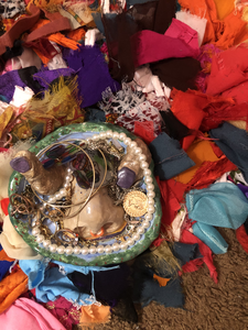
This was an assignment given after our lessons of different types of compositional photos. We had to take 9 photos of one object from different angles or in different ways and positions. I chose my clay jewelry dish. its a very odd object so I thought it would be fun to photograph!. it was all about getting what angle was most pleasing to the eye. being able to look at a photo and tell if its pleasing has really came in handy for this project and I think a photo looks best if it has a good or main focal point like with the rule of thirds technique.
|
|
|
|
Value Exercises
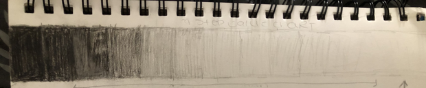
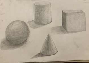
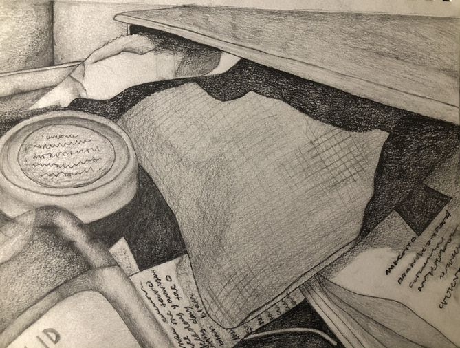
This exercise was to help prepare us for our compositional sketches. we practiced slowly altering from dark to light with all the transitions blended in. this helped us practice creating shadows and making things look more realistic. Shading can make objects appear 3-d if done correctly. Below we practiced turning shaped into 3d solids. the shadow beneath the objects and the highlighted areas seem to have a big impact in making it look as real as possible. Its easy to go from light to dark or dark to light but I've learned you have to learn how to blend so you cant see exactly where the shades alter and it can gradually turn dark or light.
Unseen Things Project
|
Reference Photos :
I took 3 photos to sketch who looked more appealing for my project. Compositional sketches :
I sketched out the 3 photos that looked most appealing as far as composition to see which one would look best as my final piece. 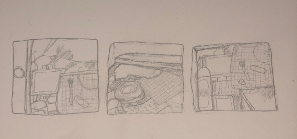
|
FINAL :
it was a very good start the only part that was really shaky was the jar.
This was a semi long process. I took may breaks and tried my best. I took the longest on the jar on the left. That's also the part of the drawing I started with until it looked just right. This project has tought me a lot about what shading can do to a picture. The many exercises we did prior to this and the live time plus feed back really helped my final product a lot. Although I'm proud of what I've done i know I can do way better.
FINAL DRAWING :
Critique Questions:
1. Explain the process you went through to develop your drawing (sketches, planning, in progress, etc). I started by taking many pictures and practicing the parts of the drawing I thought were difficult.
2. How important is composition to the success of your drawing? Very important. I even divided my paper into six sections to portion it correctly.
3. Explain how you found the different values in your object? I put the photo in black and white
4. Did you achieve a full range of the different values within your drawing? How? Yes there are parts where It's Completely black and then parts where It’s completely white and a bunch in between .
5. Describe your craftsmanship. Is the artwork executed and crafted neatly?
Yes I worked on each section until it looked clean and to my liking.
6. How important was learning the skills and techniques prior to the final drawing? Very important they helped with so many things and built my skill set.
7. How did you grow as an artist? I learned new techniques and
I’ve learned many new skills and how to make things look more realistic with shading.
8. List any obstacles you had to overcome and how you dealt with them. I couldn't get the jar right but i kept trying until it looked realistic and I found a technique for the effect I wanted on my own.
Pen and Ink Tutorial Drawings


1pt, 2pt, 3pt perspective drawings:


Final Pen Drawing :
Brainstormed ideas :
1. Hansel and Gretel crawling out of the human pie
2. The witches candy house and trees on the side
3. Ratatouille mouse as a human chef in a kitchen
4. Darwin from gumball as a realistic fish being swallowed by a shark
5. Realistic Fairy wings coming out of tinkerbells back sitting on a mushroom
6. Humpty dumpty cracked open on a counter in a kitchen next to baking supplies
7. Puss in boots drinking milk from a kitty bowl in a living room
8. Timon sleeping on pumbas head close up
9. Tiana frog princess in the frog as an elf
10. A smurf in human cartoon form sitting on a bench in the park
11. Someone with pants on legs crossed from an above angle
12. Salt and pepper shakers from a close up top angle.
3 compositional + my final sketch (bottom right)
Final Progression slide show :
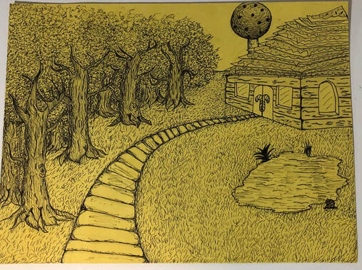
Description: I used hatching to shade the pathway and lines to shade the trees with random lines for the grass and leaves.
this was a very good exercise and helped me look at details from a different point of view.
this was a very good exercise and helped me look at details from a different point of view.
Self evaluation /Reflection Questions:
- Discuss your decision on pen and ink techniques. Why you chose to use one or more. (If you used stippling in certain areas explain why you chose this technique. Explain for all other techniques used). I used different techniques to go with the look of each object. random likes for the leaves of the tree because leaves don't go one way, straight / curved lines to match the shape of the tree and create that wood looking affect , stippling for the lollipop chimney to give that candy/ sprinkles look and last but not least small random straight likes for grass because grass is shaped like little line strokes and don't go in one direction.
- How did you use perspective? Why is perspective important? `I used perspective by drawing the objects in the photos at certain angles. This makes the scenery more realistic to the viewer and they can really see which angle or position they would be seeing this image from in perspective some things are farther away or closer or appear smaller or larger this way the view of the drawing is closer to how we see things everyday
- How is texture important in your composition? Its important because it adds more of a realistic affect and there is texture on almost every object in my drawing.
- Why is value so important in this project? Values help you see position and how an object is placed and you see this by noticing which parts of things like a tree have to be shaded darker based on what point you're seeing it from or where the sun is hitting it and where its not putting things like a tree into perspective with different values.
- Describe your craftsmanship (How well the project is crafted technically) I think its technically crafted pretty well because i have everything in my photo in perspective from one view and each shading detail compliments the objects.
- If you could recreate your piece what would you do differently to enhance your final outcome? I would definitely change the house design and be more creative also I would put more time and effort into the whole thing instead of just the trees
- (Only answer if you did fairytale) Which Fairytale or Fable did you create? How did you represent the story in your own way? I did the witches candy house and I did it my own way by designing it a different way from what I've already seen in the stories and movies.
- When applying the pen and ink techniques why and how is it important to make sure you understand the concepts taught in class? because if you don't it can ruin your drawing because its permanent and its supposed to enhance detail and f its not shaded right it can ruin the perspective of the object and make it irreversible.
- As a growing artist how do you think what you have learned will guide and better your future projects. It will help me pay closer to detail and perspective to create illusion and and realism.
Colored Pencil and Watercolor
Colored pencil forms:
  |
cone and sphere forms drawn with color pencil
|
Colored pencil fruit/veggie:
|
|
Color pencil drawing of blueberries
|


Watercolor Pears/Peppers:
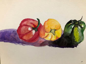
Watercolor painting of peppers
O'Keefe inspired Colored pencil/ water color Painting :
Brainstorming Ideas :
- Mandarin duck up close sleeping in water
- The under belly of a blue glaucus
- Inside of colorful crystals
- Inside of dragon fruit
- Bacteria
- Caterpillar close up
- Inside of a burrito
- Rotting teeth
- Cactus
- Leopard gecko
- Colorful iris in eye ball
- Royal sunset lily
- something up close under microscope
- Head of a beetle magnified 10x
Reference Photos :


progress photos


Final Painting:
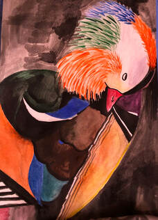
Description : My favorite part of this piece is the head the shape and swirl of the feathers look very pretty. The body was the more difficult part and it doesn't look too much like the picture but I thing it looks similar and beautiful. The body of the mandarin almost looks like they're made of shapes in the reference photo which is why the body appears more geometrical than realistic feathers.
Self evaluation / reflection questions :
1. What watercolor/colored pencil techniques proved to be effective in your painting/drawing? How and
Why? adding more water to make certain places lighter like on the white feathers I had to mix purple with lots of water to get a lavender color for shadow.
2. How important was using transparent layers (just layers for colored pencil) in your painting/drawing? It was important with the head feathers and getting some places lighter or darker than the others.
3. Explain how your composition was successful? Did you utilize all the elements of art and principles of
design? Explain. Yes, and it was successful my image filled the paper space and many shapes were used and different areas of shading and different values of colors.
4. Was color choice an important factor in the overall success of the painting/drawing? Why? Yes, because when certain colors look to close to each other it tends to look like a big blob and that way you have to choose colors that contrast because its better the see the different feathers clearly.
5. How did you use your knowledge of Georgia O’Keeffe as inspiration for this piece? His use of colors and how they harmonize together to create one piece instead of having individual parts in a painting.
6. Describe your craftsmanship. My craftsmanship is a very go for it attitude I like to plan out small details to meets requirements but let my brain do the rest and go with what looks good.
7. If you were an art critic how would you judge your work? lots of Potential nice mesh of colors on the body head was nicely drawn , the dark background was a bad idea.
8. If you were able to do something different what would it be and why? change the back ground because it dimmed the painting and kind of meshed with the darkness of body colors
9. Explain to me what you have learned about watercolor/colored pencil and how it has improved or
discouraged your development in art. I've learned that colors can still give detail all with the changing of values and not everything ahs to be in black and white to have realism even if its not something that Isn't that color in real life. also that nothing we paint or draw is ever just one color. This helped me a lot.
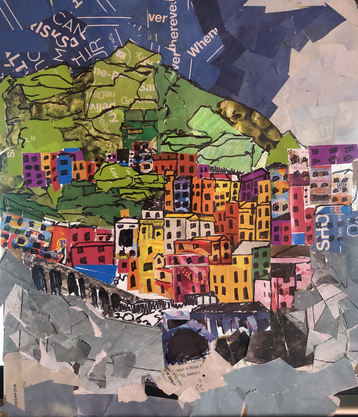
Collage project :
Brainstorming ideas :
- Switzerland ( houses)
- Grand Prismatic Spring, Yellowstone National Park, USA
- Lake Hilier, Australia
- Pamukkale Thermal Pools, Turkey
- Walk the Haiku Stairs in Oahu, Hawaii
- Marvel at the Pangong Tso Lake in Ladakh, Himalayas
- Mooch around Montreal Botanical Garden, Canada
- Cinque Terre, Riomaggiore, Italy
- Santorini, Greece
Reference Photos :


Final Piece :
|
Description: The building reminded me of a bunch of Lego blocks and my piece kind of imitates that. it was fun putting a scenery together without drawing and coloring. I think this looks like a form of abstract scrap book art and I am in LOVE.
|
Self evaluation/ Reflection questions:
- Describe why you chose your subject matter and what makes the composition interesting? I like how all the colorful buildings are bunched together and they remind me of Lego blocks. so I thought it would be cool as a collage
- Describe the accuracy of your proportion, values and shading. Not very well, I will say I could've done so much better with values because I didn't add many although I tried to in some spots with different color shades
- How did you use texture to add visual interest? for the bottom rocks I used gritty newspaper like bag pieces so the can look rough and I cut them poorly
- How did you decide what shapes and textures to use for your collage? based on the shapes of the objects in the picture and basically what I saw beyond the actual architecture. Also I drew the out line of everything in the photo and with the paper I just did my best to fill in those lines and with that I used what ever shape In had to cut to fit.
- Do you feel that you used a full range of values to reproduce your photo in the collage format? How have you attempted to create depth using foreground, middle ground and background? I over lapped pieces to create the look of middle ground fore ground and back ground. but as far as values and details go my piece doesn't have much it came out more abstract and scrap-booky than accurate and realistic through the illusion of values and shapes.
- Describe your craftsmanship. Is the artwork executed and neatly crafted? Definitely not neat but I kind of like that about it. its more abstract than accurate. Overall it is executed though, it is a cool image with different parts creating a beautiful scenery
- Describe how you might improve your artwork if you were to redo the project? take more time on it, give it more value and depth and pay attention to small details
